Remember the days of squinting at text on a tiny mobile screen or having to pinch and zoom to navigate a website? Thankfully, those struggles are largely a thing of the past thanks to responsive website design. But with so many new technologies emerging, is responsive design still important? Absolutely! In this article, we’ll delve into why responsive design remains a crucial element for any website in 2024 and beyond.
What is Responsive Website Design?
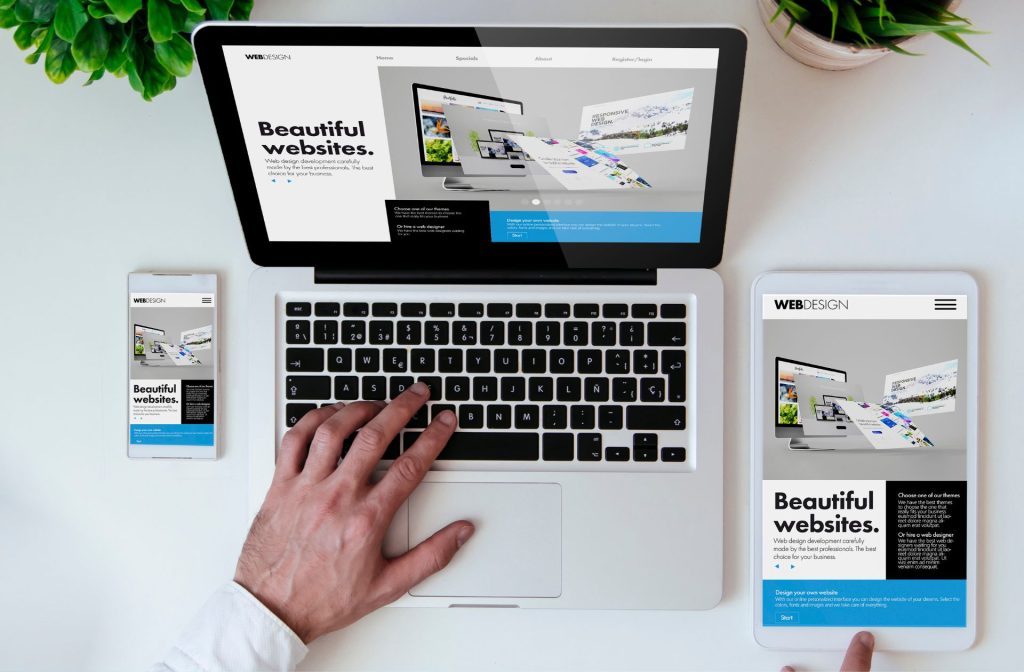
Responsive website design is a web design approach that ensures your website automatically adjusts its layout, content, and images to perfectly fit the screen size of any device, be it a desktop computer, a tablet, or a smartphone.

Imagine a website that transforms like magic – on a large screen, it displays beautiful high-resolution images and neatly organized content. But when viewed on a mobile phone, the website shrinks down, reorganizes its elements, and enlarges text for easy reading. That’s the power of responsive design!
Why is Responsive Website Design Still Important?
Here are some key reasons why responsive web design remains essential for your website:
Unmatched User Experience (UX):
According to a Statcounter report over 55% of all web traffic now comes from mobile devices. A responsive website delivers a seamless and frustration-free experience for users on any device. No more pinching, zooming, or scrolling sideways. Visitors can easily find the information they need, navigate menus, and complete actions, leading to higher satisfaction and increased engagement.
Search Engine Optimization (SEO) Boost:
Search engines like Google prioritize mobile-friendly websites in their search rankings. A responsive web design ensures your website is easily crawled and indexed by search engines, regardless of the device used to access it. This translates to better search engine visibility and potentially more organic traffic to your website.
Cost-Effective Maintenance:
Maintaining separate websites for desktop and mobile can be a burden on both time and resources. Responsive design allows you to manage just one website that adapts to all devices. This simplifies website updates, content edits, and overall maintenance, saving you time and money in the long run.
Enhanced Brand Consistency:
A responsive website ensures your brand identity – colors, fonts, logos, and overall visual style – remains consistent across all devices. This reinforces brand recognition and creates a professional image for your business.
Future-Proofing Your Website:
The way we access the internet is constantly evolving. With new devices and screen sizes emerging all the time, a responsive website ensures you’re prepared for whatever the future holds. Your website will adapt and deliver a great user experience on any new device that comes along.
Reports indicate that responsive websites can lead to a:
- 20% increase in conversion rates (visitors taking a desired action on your website)
- 15% decrease in bounce rates (visitors leaving your website immediately)
- 10% improvement in average time spent on site
These statistics highlight the significant impact responsive design can have on your website’s success.
Responsive Design FAQs
Q: Is responsive design difficult to implement?
A: Responsive design has become a standard practice in web development. Many website builders and content management systems (CMS) offer built-in responsive design features, making it easier than ever to create a responsive website. There are also a variety of responsive design frameworks available that developers can use to streamline the process.
Q: Do I need to redesign my existing website to be responsive?
A: It depends on the age and structure of your website. If your website was built with older technologies, it might be more efficient to start from scratch with a responsive design. However, for many websites, a conversion to responsive design is possible. Consult with a web developer to discuss the best approach for your specific website.
Q: How can I test if my website is responsive?
A: There are several free online tools available that can test your website’s responsiveness. You can also use Google’s Mobile-Friendly Test to see how your website looks and functions on various mobile devices.
Q: What is the importance of responsive design?
A: Responsive design makes sure your website looks great and functions smoothly on any device, from desktops to tablets to smartphones. It ensures a frustration-free experience for users, no matter how they access your website.
Q: What is responsive blog design?
A: It’s a specific type of responsive design focused on blogs. It guarantees your blog posts and content adapt perfectly to any screen size, delivering a seamless reading experience for visitors on all devices.
Q: What is the main goal of responsive design?
A: The main goal is to create a single website that adjusts automatically to fit the user’s device. This ensures a positive user experience, regardless of whether they’re on a large computer screen or a tiny phone.
Q: Why is responsive design important and Google approved?
A: Responsive design is important because most web traffic comes from mobile devices. Google prioritizes mobile-friendly websites in search results. So, a responsive website is more likely to rank higher in searches and get seen by more people.
Q: What is the importance of responsive service?
A: While responsive design focuses on websites, responsive service emphasizes a customer service approach that adapts to the customer’s needs and communication style.
Q: What is the importance of responsive design in mobile app development?
A: Responsive design principles can be applied to mobile app development as well. This ensures the app layout adjusts to different screen sizes and phone models, offering an optimal user experience for everyone.
Q: What are the three main elements of responsive design?
Flexible Layout: The website’s structure adapts to different screen sizes, resizing elements like menus and images to fit the device.
Fluid Images and Media: Images and videos on the website automatically adjust their size to fit the screen, preventing blurry or stretched visuals.
Media Queries: These are codes that instruct the website how to adjust its layout based on the device’s screen size and resolution.
Q: What are the advantages of responsive web design?
There are many advantages! Improved user experience, better search engine ranking, cost-effective website maintenance, consistent brand image, and future-proofing your website for new devices are just a few.
Q: What is fully responsive design?
This simply means the website responds and adjusts perfectly to any screen size, offering an optimal viewing experience on all devices.
Q: What are two benefits of responsive UI? (UI = User Interface)
A responsive UI offers two key benefits: 1) Universality: One user interface works flawlessly across all devices, ensuring a consistent experience for everyone. 2) Usability: The UI adapts to the device’s capabilities, making it easy for users to interact with the website on any screen.
Q: How to use responsive web design?
While the technical aspects are handled by web developers, you can leverage website builders or CMS (Content Management Systems) that offer built-in responsive design features. These tools allow you to create a website that automatically adjusts for different devices.
Q: What is one advantage of responsive design for a developer?
Responsive design saves developers time and resources. They only need to maintain one website that adapts to all devices, instead of creating separate versions for mobile and desktop.
Q: What kind of testing is important in responsive design?
Testing ensures your website functions properly on various devices. You can use online tools or Google’s Mobile-Friendly Test to see how your website looks and works on different screen sizes.
Q: What is responsive web design and its importance in modern web development?
Responsive web design is a website development approach that ensures your website looks great and functions smoothly on all devices. In today’s world, where most people access the internet through mobile devices, responsive design is crucial for modern web development. It guarantees a positive user experience, improves search engine ranking, and helps your website stay competitive.
Q: Why is responsive web design important in today’s mobile-first world?
With more and more people using smartphones and tablets to browse the web, responsive design is essential. It ensures your website delivers an optimal experience on any device, keeping your visitors engaged and coming back for more.
By prioritizing responsive design, you’re ensuring your website delivers a positive experience for all visitors, regardless of the device they use. In today’s mobile-first world, responsive design is no longer an option – it’s a necessity for any website that wants to thrive online.